The project is a commissioned initiative, created without commercial intentions. The publishing decision was to extend the focus from the artist’s works and emphasize also on a comprehensive typographic design that responds to both the artworks and the poem written by the artist, while shaping a material–physical concept for the artist’s book. By combining various printing and binding techniques, the project explored the boundaries of paper as a material, as well as the traditional definition of the “book.”
The turn to handcrafted solutions – prompted by the limitations of conventional printing and production technologies (such as offset printing and industrial binding) – opened up a world of craft and collaborations with rare, highly skilled professionals. A well-printed book is never solely the result of successful design; working alongside master craftspeople adds a significant design layer, rooted in experience, creativity, and unexpected solutions that challenge conventional perceptions of the printed medium and the paged format.
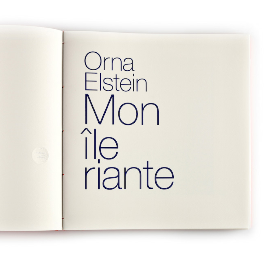
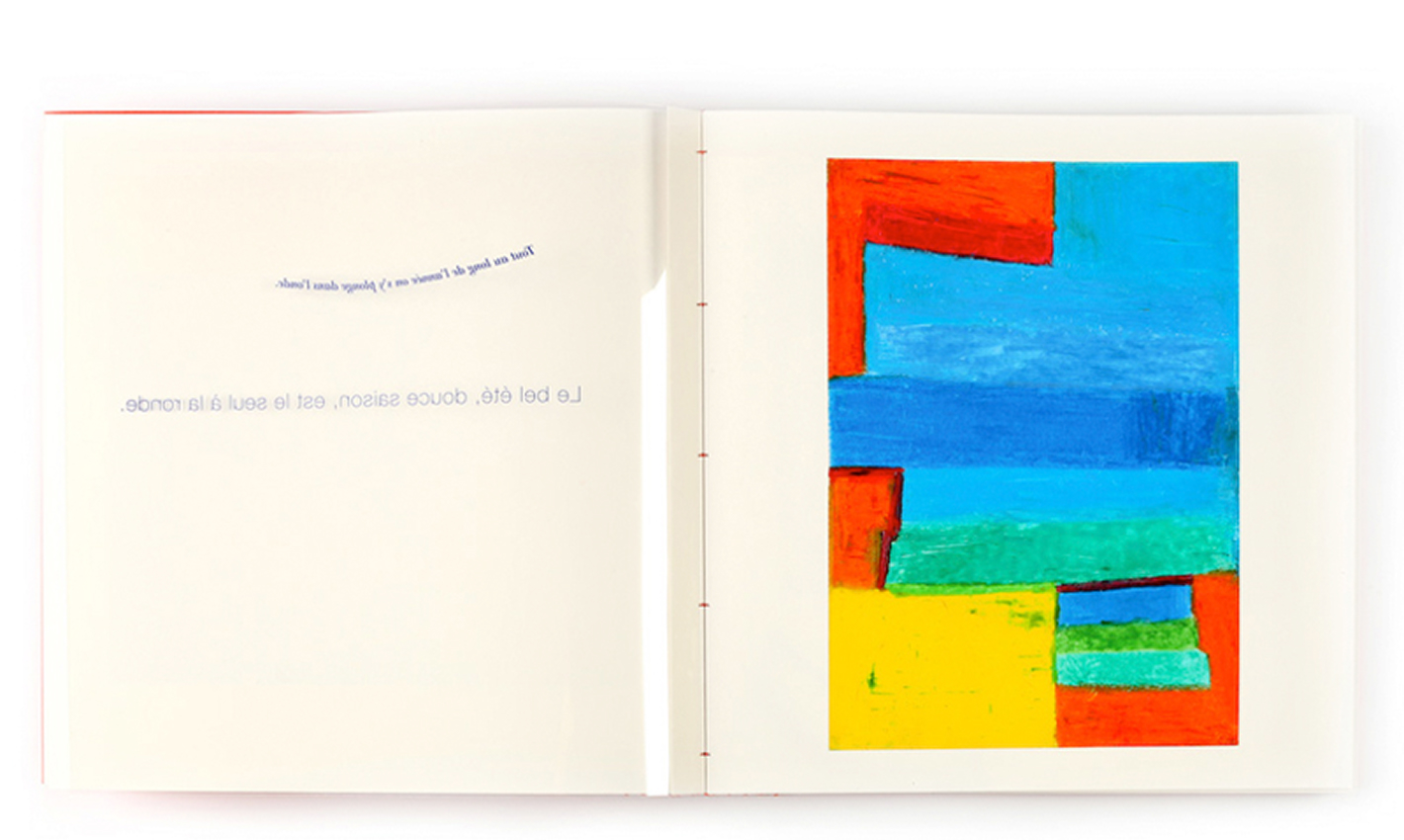
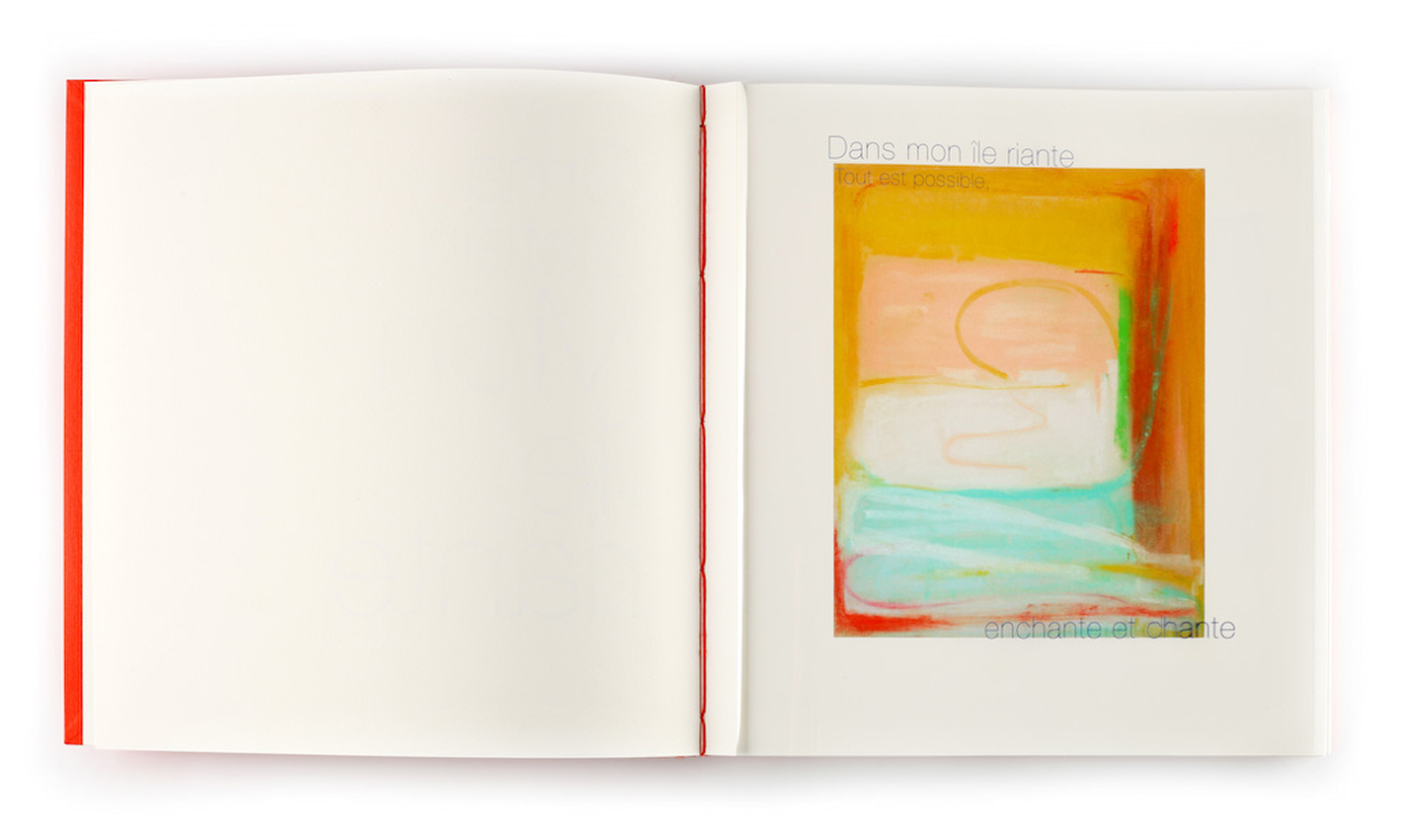
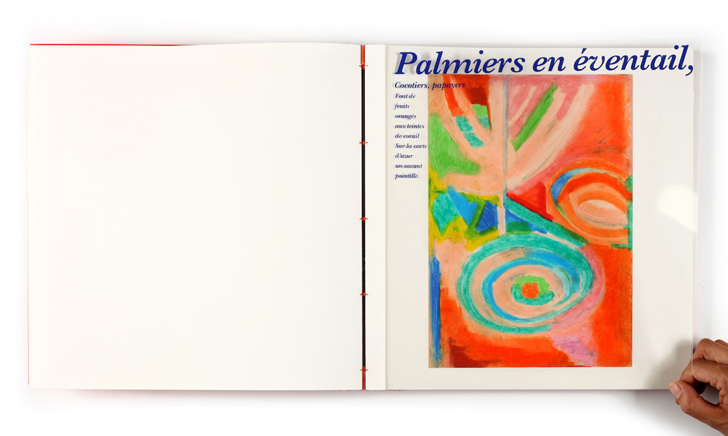
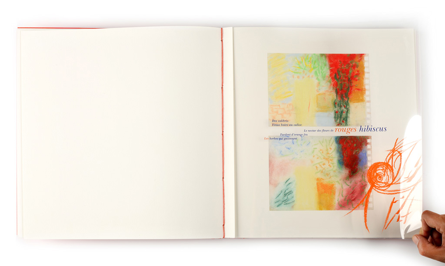
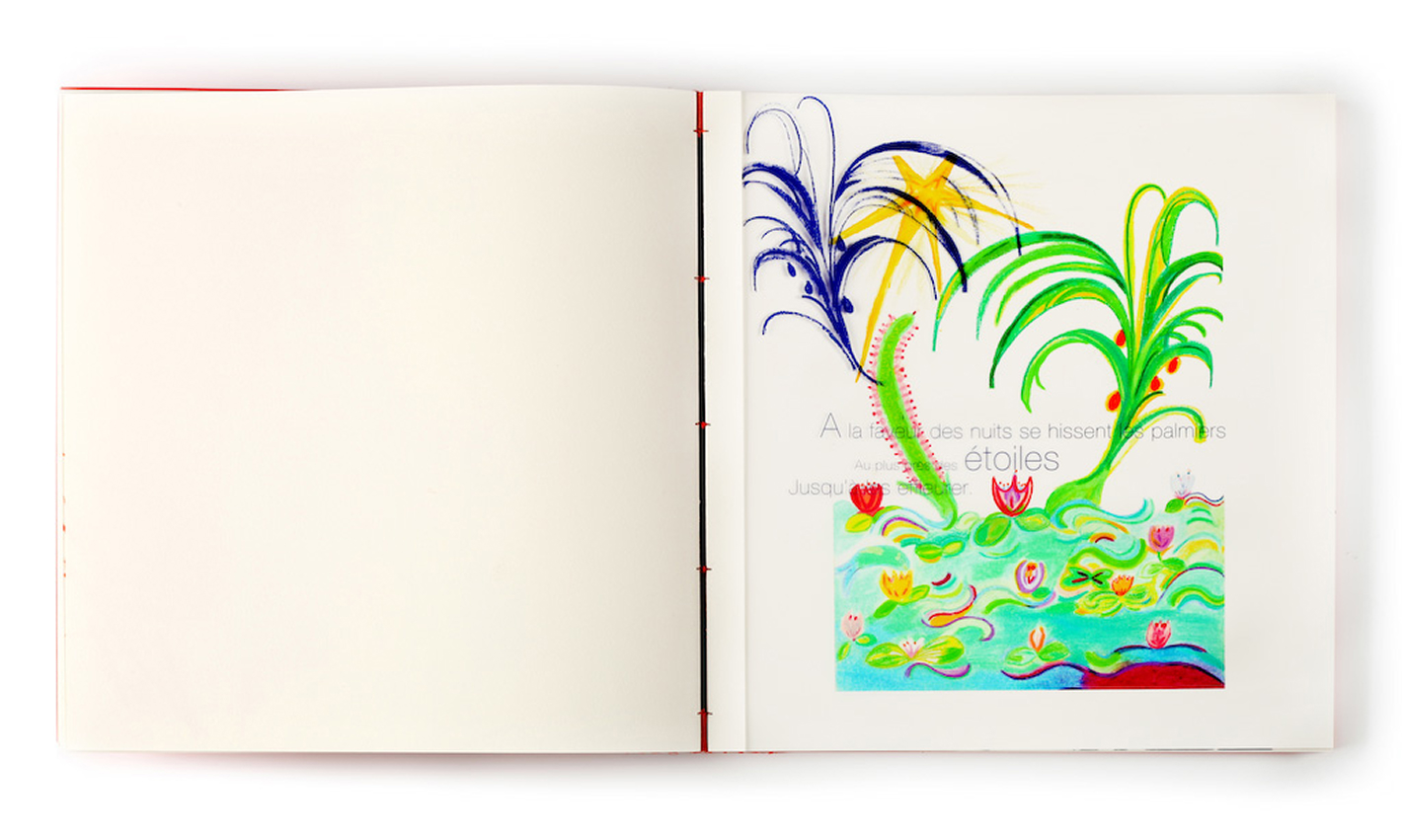
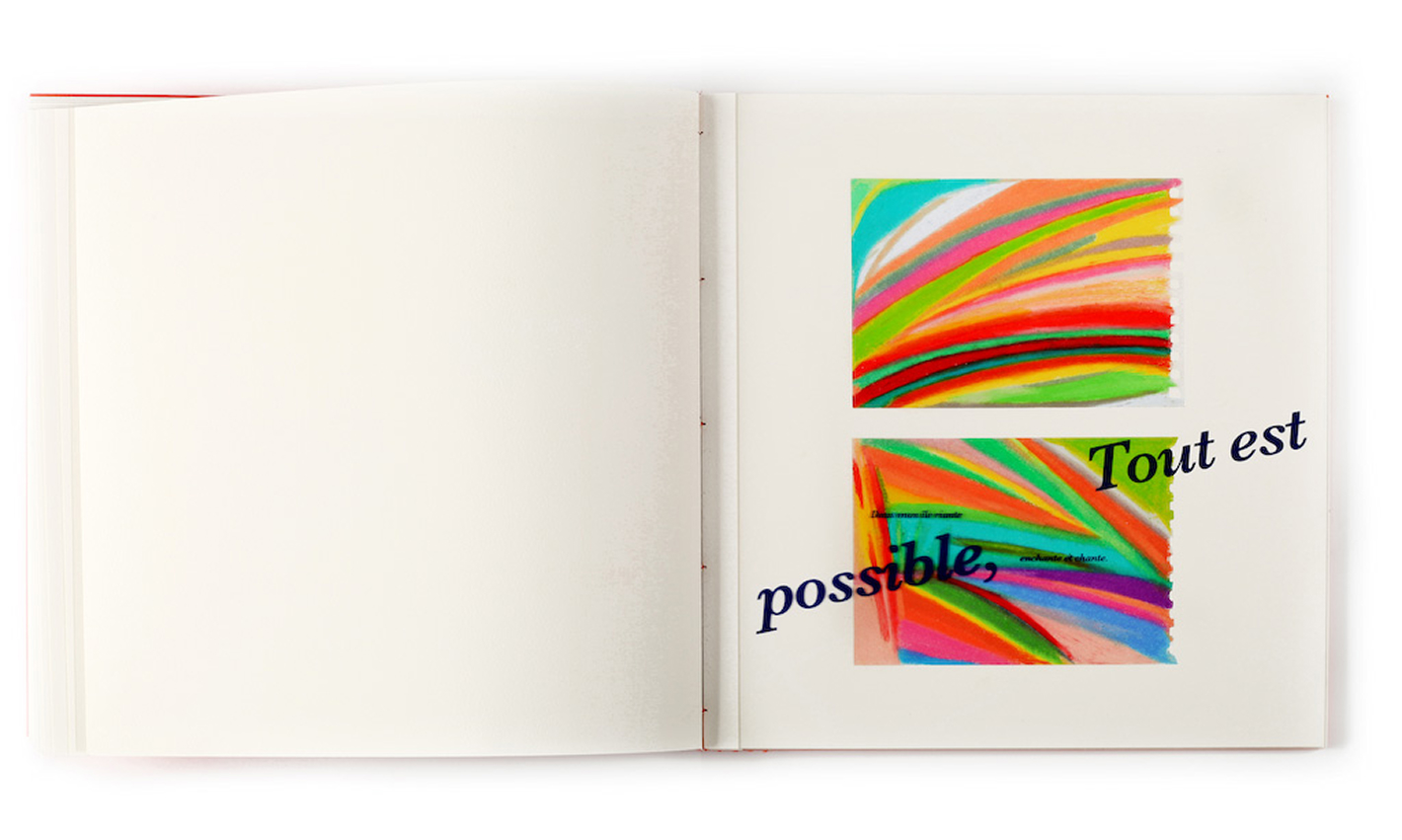
The choice of transparent material stemmed from a direct connection to the content: the poem, written on the shores of the Seychelles (where the artworks were also created), offers a philosophical perspective on the beach as a place of refuge. The transparency allows for layered readings – of the text, the images, and the interactions between them. The typography was screen printed onto acetate sheets, each of which was mounted onto a strip of paper and hand-sewn into the signatures, due to the transparent material’s resistance to conventional binding methods.
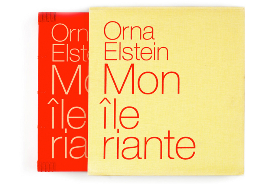
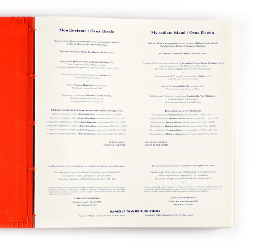
The book was published in a series of numbered editions in two languages – Hebrew and French – in both hand-bound formats and print portfolio boxes. Each copy is numbered and signed by the artist.