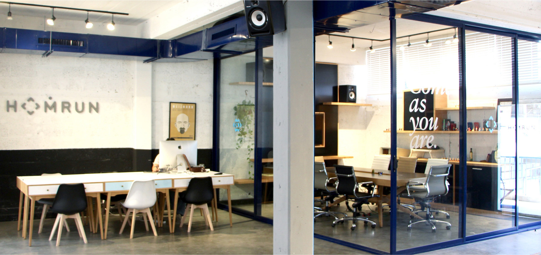
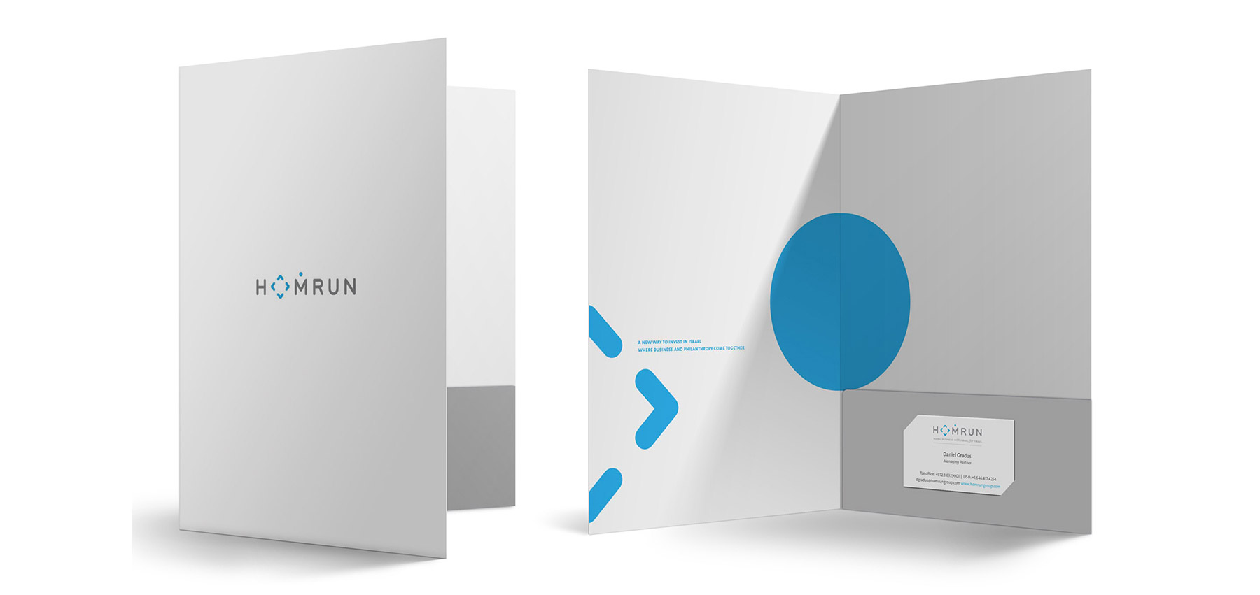
Homrun is an Israeli-American fund that bridges Israeli startups with Jewish business leaders across the U.S. and Canada. As a hybrid of venture capital and philanthropic vision, Homrun operates at the intersection of growth, values, and community.
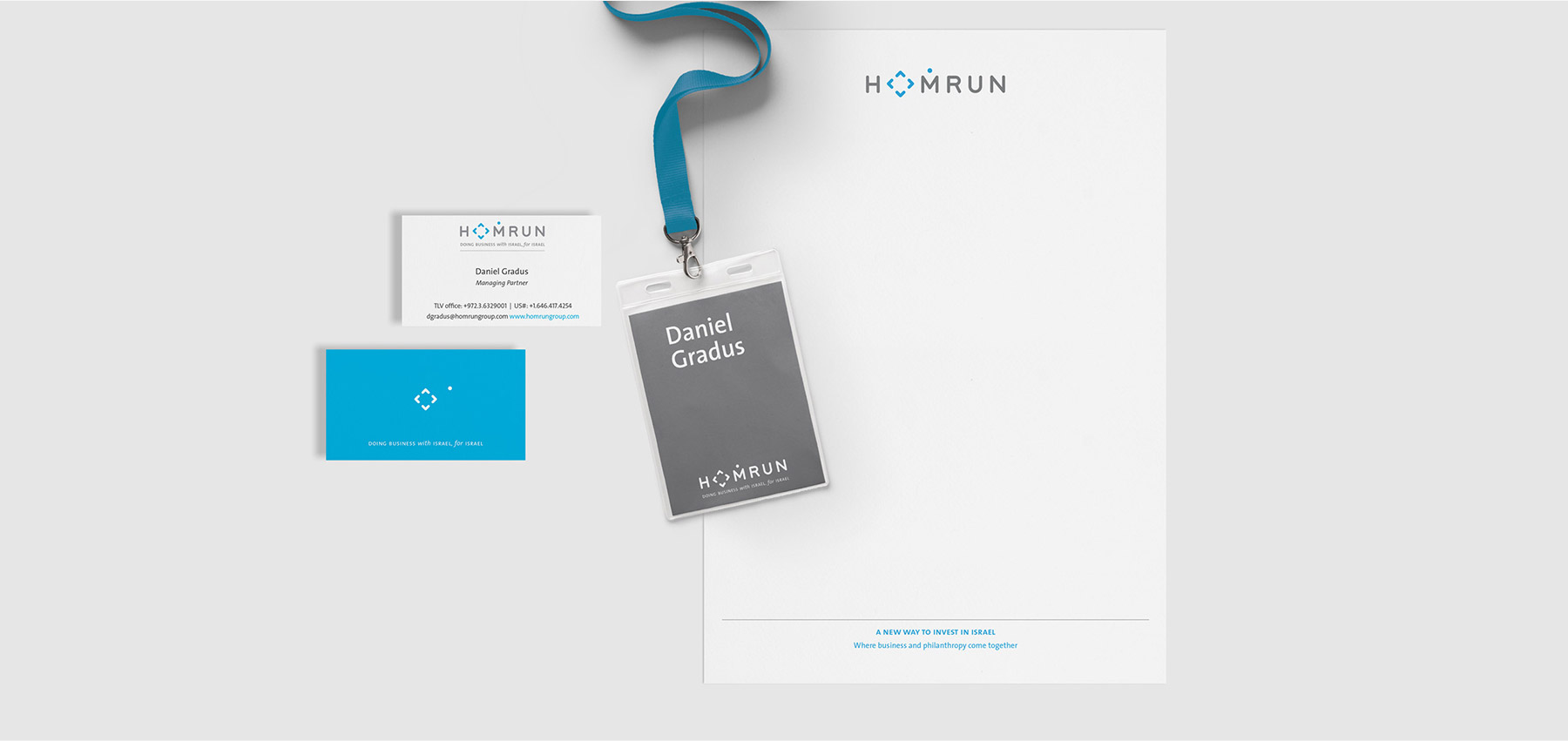
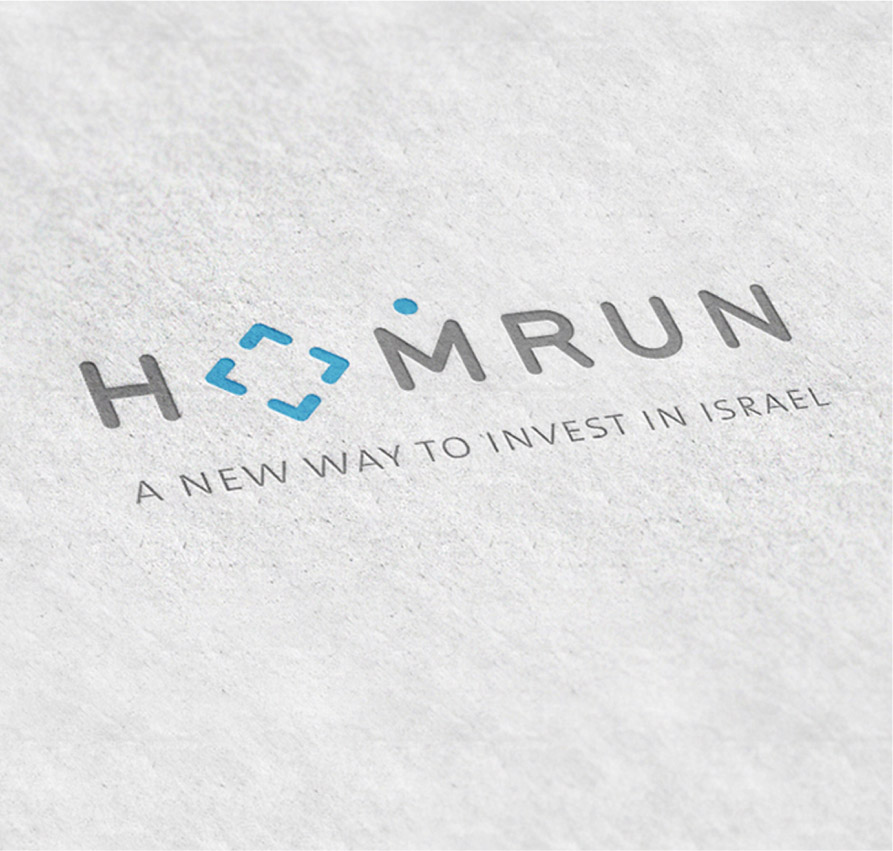
Our challenge was to craft a visual identity for a multifaceted, cross-cultural initiative – one that feels just as at home in Tel Aviv as it does in New York. The brand language is intentionally precise, modern, and restrained, with subtle references to movement, connectivity, and Jewish heritage. Typography is clean and modular; the symbol suggests both direction and community. Color choices reflect a calm confidence – anchored in trust, yet forward-looking.
The result is a brand that doesn’t shout. It invites. With a wink.